Blog Home
R for Data Science Two Categorical Variables
From R for Data Science
1-How could you rescale the count dataset above to more clearly show the distribution of cut within color, or color within cut?
Show color as a percentage of cut, and color as a percentage of cut.
diamonds_prop_cut_color <- diamonds |>
  group_by(color, cut) |>
  summarize(count = n()) |>
  mutate(prop = count/sum(count))

diamonds_prop_color_cut <- diamonds |>
  group_by(cut, color) |>
  summarize(count = n()) |>
  mutate(prop = count/sum(count))

ggplot(diamonds_prop_cut_color, aes(x = cut, y = color)) +
  geom_tile(aes(fill = prop))

ggsave("r-10-5-2-1-q1_1.png")

ggplot(diamonds_prop_color_cut, aes(x = color, y = cut)) +
  geom_tile(aes(fill = prop))

ggsave("r-10-5-2-1-q1_2.png")


2-What different data insights do you get with a segmented bar chart if color is mapped to the x aesthetic and cut is mapped to the fill aesthetic? Calculate the counts that fall into each of the segments.
ggplot(diamonds, aes(x = color, fill = cut)) +
geom_bar()

ggsave("r-10-5-2-1-q2.png")

diamonds |>
 count(color, cut)
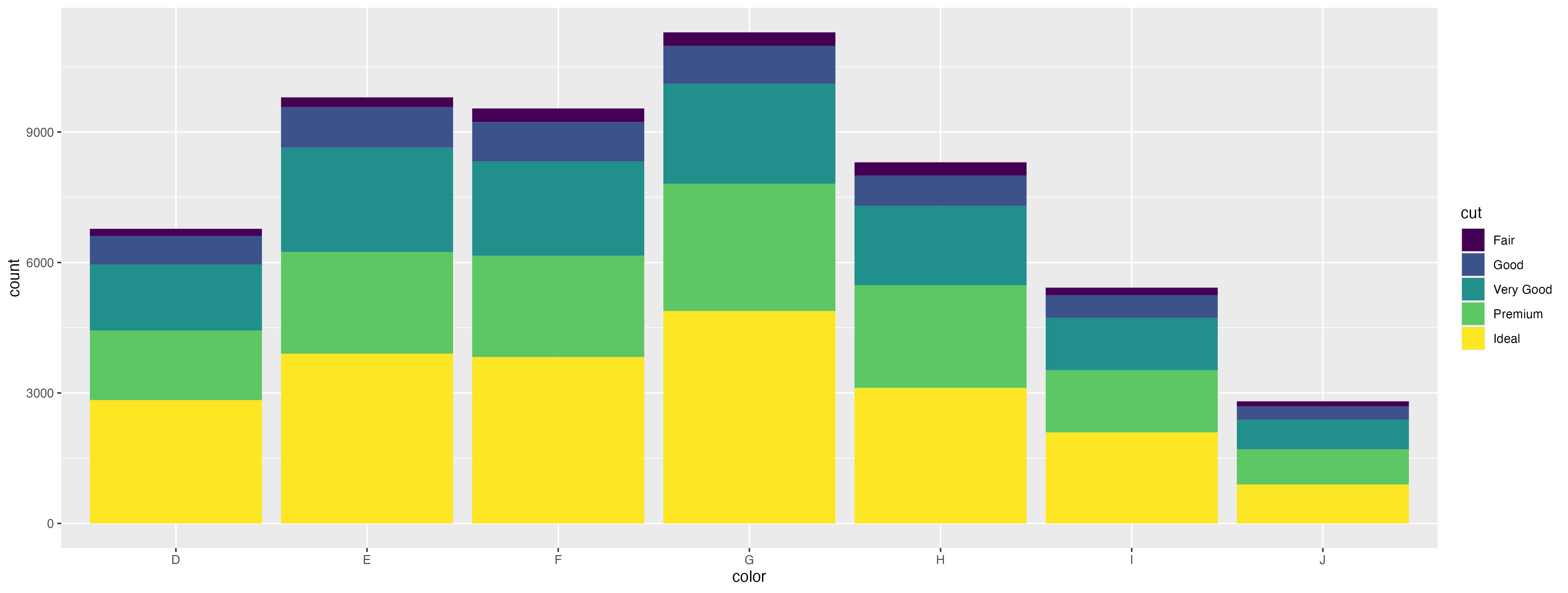
This bar chart shows that the color G has the most diamonds; the largest amount of diamonds are considered ideal, premium, and very good, while the least amount of diamonds are considered fair and good. The counts within each segment show the total diamonds that are the cut within in each color then
3-Use geom_tile() together with dplyr to explore how average flight departure delays vary by destination and month of year. What makes the plot difficult to read? How could you improve it?
The plot with average departure delay by destination and month is difficult to read because there are too many destination values. The plot could be improved by filtering only to certain ranges of average delays, arranging the plot by average delays, or only selecting destinations with a certain number of flights.
nycflights13::flights |>
 #filter(str_detect(dest, "^A")) |>
  group_by(dest, month) |>
  summarize(avg_delay = mean(dep_delay, na.rm = TRUE), na.rm = TRUE) |>
  ggplot(aes(x = dest, y = factor(month))) +
  geom_tile(aes(fill = avg_delay))

ggsave("r-10-5-2-1-q3_1_rev.png")
