Blog Home
R for Data Science Two Numerical Variables
From R for Data Science
1- Instead of summarizing the conditional distribution with a boxplot, you could use a frequency polygon. What do you need to consider when using cut_width() vs. cut_number()? How does that impact a visualization of the 2d distribution of carat and price?
The number of groupings and the whole number divisions should be considered when using cut_width and cut_number also.
ggplot(diamonds, aes(color = cut_number(carat, 7), x = price)) +
  geom_freqpoly()

ggsave("r-10-5-3-1-q1_1.png")

ggplot(diamonds, aes(color = cut_width(carat, 1, boundary = 0), x = price)) +
  geom_freqpoly()

ggsave("r-10-5-3-1-q1_2.png")


2- Visualize the distribution of carat, partitioned by price.
ggplot(diamonds, aes(color = cut_number(carat, 5), x = price)) +
  geom_histogram(aes(fill = cut_number(carat, 5)))

ggsave("r-10-5-3-1-q2.png")

3-How does the price distribution of very large diamonds compare to small diamonds? Is it as you expect, or does it surprise you?
I separated out the diamonds dataset into what, according to a histogram based on size (x variable) would be the smaller diamonds, with values < 4.5; and the large diamonds where x > 7.5. Then, I created boxplots showing the price distribution of large and small diamonds. The small diamonds show an expected distribution, where, as the diamonds increase in size, they increase in price. The distribution of larger diamonds is less expected, because, after around a size of 8.4, the price does not necessarily increase with size, and after size 9, the price becomes variable and can decrease with the size increase
ggplot(diamonds, aes(x = x)) +
  geom_histogram()

ggsave("r-10-5-3-1-q3_1.png")

#diamonds |>
#  filter(x >7.5) |>
#  ggplot(aes(x = x, y = price)) +
#  geom_hex()
#  geom_boxplot(aes(group = cut_number(x, 5)))

diamonds |>
  filter(x > 0 & x <= 4.5) |>
  ggplot(aes(x = x, y = price)) +
  #geom_hex()
  geom_boxplot(aes(group = cut_width(x, 0.1)))

ggsave("r-10-5-3-1-q3_2.png")

diamonds |>
  filter(x > 7.5) |>
  ggplot(aes(x = x, y = price)) +
  #geom_hex()
  geom_boxplot(aes(group = cut_width(x, 0.1)))

ggsave("r-10-5-3-1-q3_3.png")

#diamonds |>
#  filter((x > 0 & x <= 4.5) | (x > 7.5)) |>
#  ggplot(aes(x = x, y = price)) +
  #geom_hex()
#  geom_boxplot(aes(group = cut_number(x,10)))

#diamonds |>
#  filter(x > 0 & x <= 4.5) |>
#  ggplot(aes(x = x, y = price)) +
#  geom_point() +
#  geom_smooth(method = lm)
  #geom_boxplot(aes(group = cut_number(x,10)))

#diamonds |>
#  filter(x > 7.5) |>
#  ggplot(aes(x = x, y = price)) +
#  geom_point() +
#  geom_smooth(method = lm)
  #geom_boxplot(aes(group = cut_number(x,10)))


4-Combine two of the techniques you’ve learned to visualize the combined distribution of cut, carat, and price.
diamonds |>
  filter(carat > 0) |>
  ggplot(aes(x = cut_number(carat,5), y = price)) +
  geom_boxplot(aes(fill = cut))

ggsave("r-10-5-3-1-q4.png")

5-Two dimensional plots reveal outliers that are not visible in one dimensional plots. For example, some points in the following plot have an unusual combination of x and y values, which makes the points outliers even though their x and y values appear normal when examined separately. Why is a scatterplot a better display than a binned plot for this case?
A binned plot would not show the outliers in what should be the linear relationship in the x and y values, and would only combine the counts into a bin
diamonds |>
  filter(x >= 4) |>
  ggplot(aes(x = x, y = y)) +
  geom_point() +
  coord_cartesian(xlim = c(4, 11), ylim = c(4, 11))
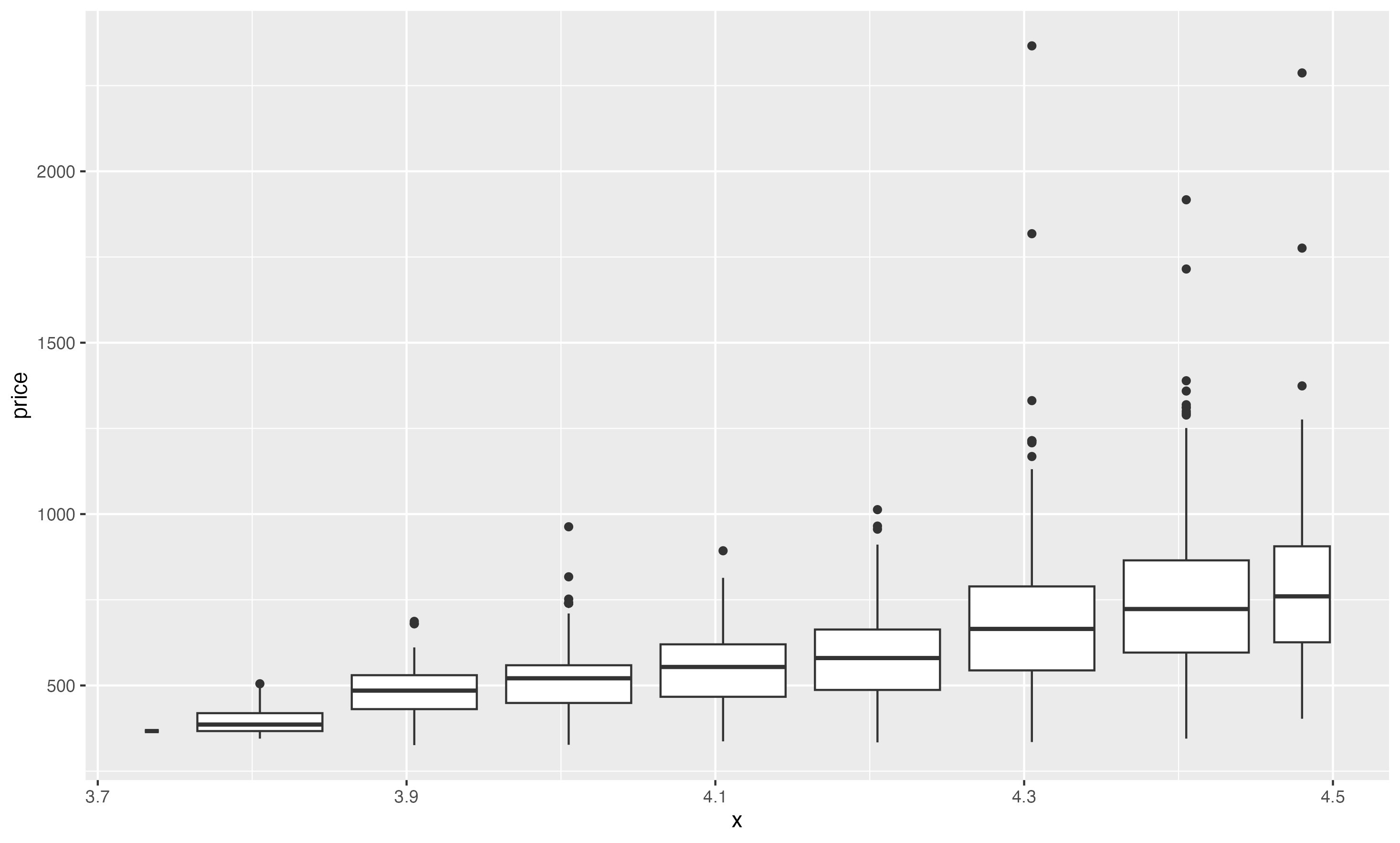
6-Instead of creating boxes of equal width with cut_width(), we could create boxes that contain roughly equal number of points with cut_number(). What are the advantages and disadvantages of this approach?
An advantage of using cut_number instead of cut_width is that the width on the boxplot shows that there are more or less values at the price/carat combination. The boxplot over 2 carats at the higher price point shows that there are more diamonds at that combination, and where the width is smaller, those are fewer. The disadvantage is that the distribution and relationship can be harder to determine when the widths are variable, and some of the boxplots are very narrow and can be obscured by the others. The distribution within some of the larger plots can be seen more with adjusting the cut_width() also
ggplot(smaller, aes(x = carat, y = price)) +
  geom_boxplot(aes(group = cut_number(carat, 20)))

ggsave("r-10-5-3-1-q6_1.png")

ggplot(smaller, aes(x = carat, y = price)) +
  geom_boxplot(aes(group = cut_width(carat, 0.15)))

ggsave("r-10-5-3-1-q6_2.png")

