Blog Home
R for Data Science: Labels
From R for Data Science
1-Create one plot on the fuel economy data with customized title, subtitle, caption, x, y, and color labels.
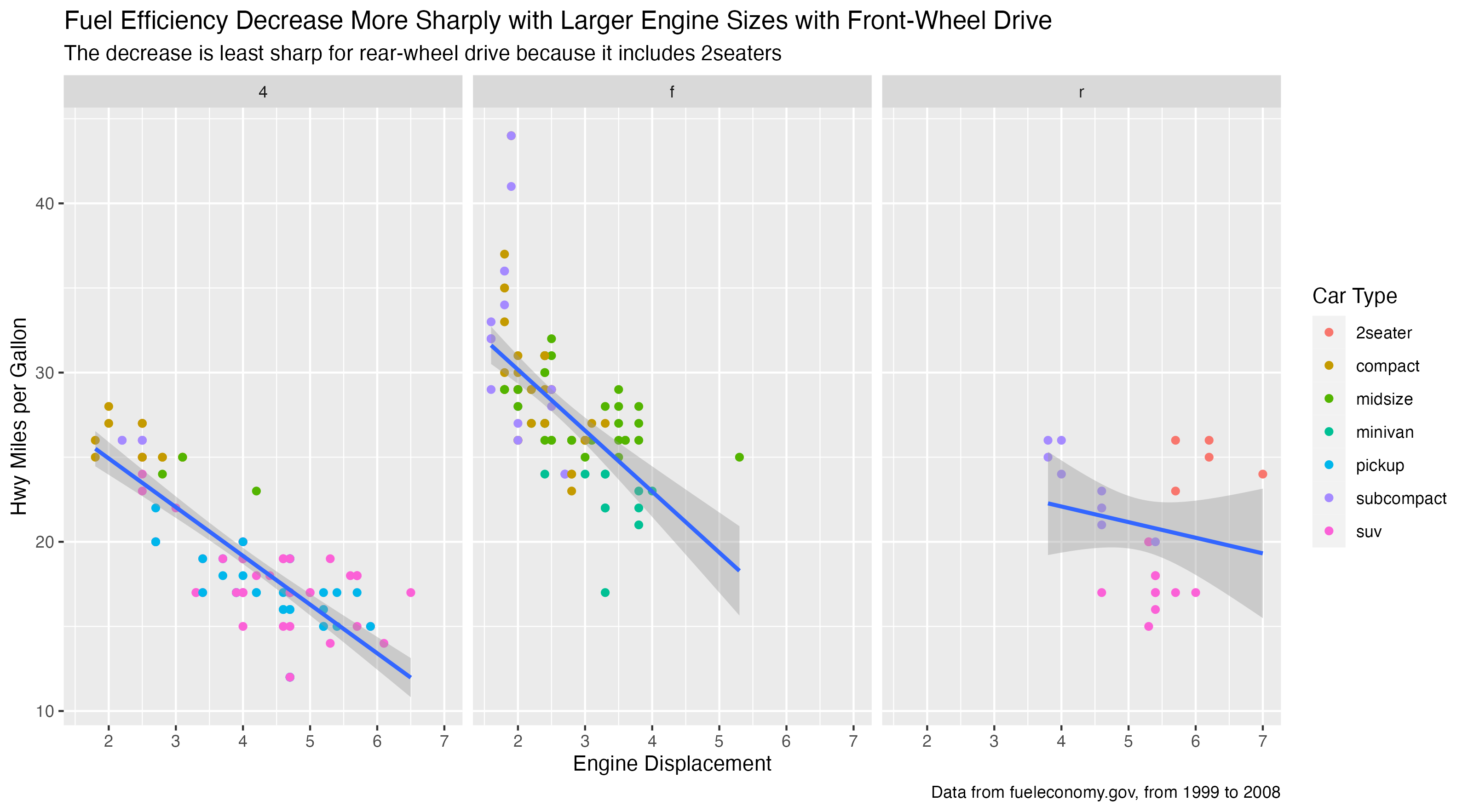
ggplot(mpg, aes(x = displ, y = hwy)) +
  geom_point(aes(color = class)) +
  geom_smooth(method = lm) +
  facet_wrap(~drv) +
  labs(
    title = "Fuel Efficiency Decrease More Sharply with Larger Engine Sizes with Front-Wheel Drive",
    subtitle = "The decrease is least sharp for rear-wheel drive because it includes 2seaters",
    x = "Engine Displacement",
    y = "Hwy Miles per Gallon",
    color = "Car Type",
    caption = "Data from fueleconomy.gov, from 1999 to 2008"
)

ggsave("r-11-2-1-q1.png")
2-Recreate the following plot using the fuel economy data. Note that both the colors and shapes of points vary by type of drive train.
ggplot(mpg, aes(x = cty, y = hwy)) +
  geom_point(aes(shape = drv, color = drv)) +
  labs(
    x = "City MPG",
    y = "Hwy MPG",
    color = "Type of Drive Train",
    shape = "Type of Drive Train"
)

ggsave("r-11-2-1-q2.png")

3-Take an exploratory graphic that you’ve created in the last month, and add informative titles to make it easier for others to understand.
diamonds |>
  filter(carat > 0) |>
  ggplot(aes(x = cut_number(carat,5), y = price)) +
  geom_boxplot(aes(fill = cut)) +
  labs(
    title = "Diamond prices increase with larger carat sizes",
    subtitle = "Larger carat diamonds with better cuts have avg higher prices",
    x = "Carat",
    y = "Price"
)

ggsave("r-11-2-1-q3.png")
