Blog Home
R for Data Science - Scales
From R for Data Science
Why doesn’t the following code override the default scale?
df <- tibble(
  x = rnorm(10000),
  y = rnorm(10000)
)

ggplot(df, aes(x, y)) +
  geom_hex() +
  scale_color_gradient(low = "white", high = "red") +
  coord_fixed()

ggplot(df, aes(x, y)) +
  geom_point( aes(color =x)) +
  scale_color_gradient(low = "white", high = "red") +
  coord_fixed()

ggsave("r-11-4-6-q1.png")
geom_hex() uses fill instead of color, but also, it would need a group and a color on geom_hex for scale_color_gradient. When this is provided for geom_point(), which also uses fill, the gradient changes.

2-What is the first argument to every scale? How does it compare to labs()?
The first argument to every scale is name. It is different from the first argument to labs(), which is title, because a default is provided for name, and if no value is provided to the title argument, none is provided.
3-Change the display of the presidential terms by:
- Combining the two variants that customize colors and x axis breaks.
- Improving the display of the y axis.
- Labelling each term with the name of the president.
- Adding informative plot labels.
- Placing breaks every 4 years (this is trickier than it seems!).
presidential |>
  mutate(id = 33 + row_number()) |>
  ggplot(aes(x = start, y = id, color = party)) +
  geom_point() +
  geom_segment(aes(xend = end, yend = id)) +
  scale_color_manual(values = c(Republican = "#E81B23", Democratic = "#00AEF3"))

presidential |>
  mutate(id = 33 + row_number()) |>
  mutate(id_name = paste(id, name)) |>
   mutate(term_length = round(as.numeric(difftime(as.Date(end), as.Date(start), unit = "weeks"))/52.25, digits = 0)) |>
  ggplot(aes(x = start, y = id_name, color = party)) +
  geom_point() +
  geom_segment(aes(xend = end, yend = id_name)) +
  scale_color_manual(values = c(Republican = "#E81B23", Democratic = "#00AEF3")) +
  labs(y = "Presidential Terms") +
  geom_text(
    aes(x = start, y = id_name, label = paste(party,"-",name,"-",term_length, "yrs")),
    size = 3, vjust = "bottom", hjust = "left"
) +
  scale_x_date(date_breaks = "4 years", date_labels = "%Y")

ggsave("r-11-4-6-q3.png")

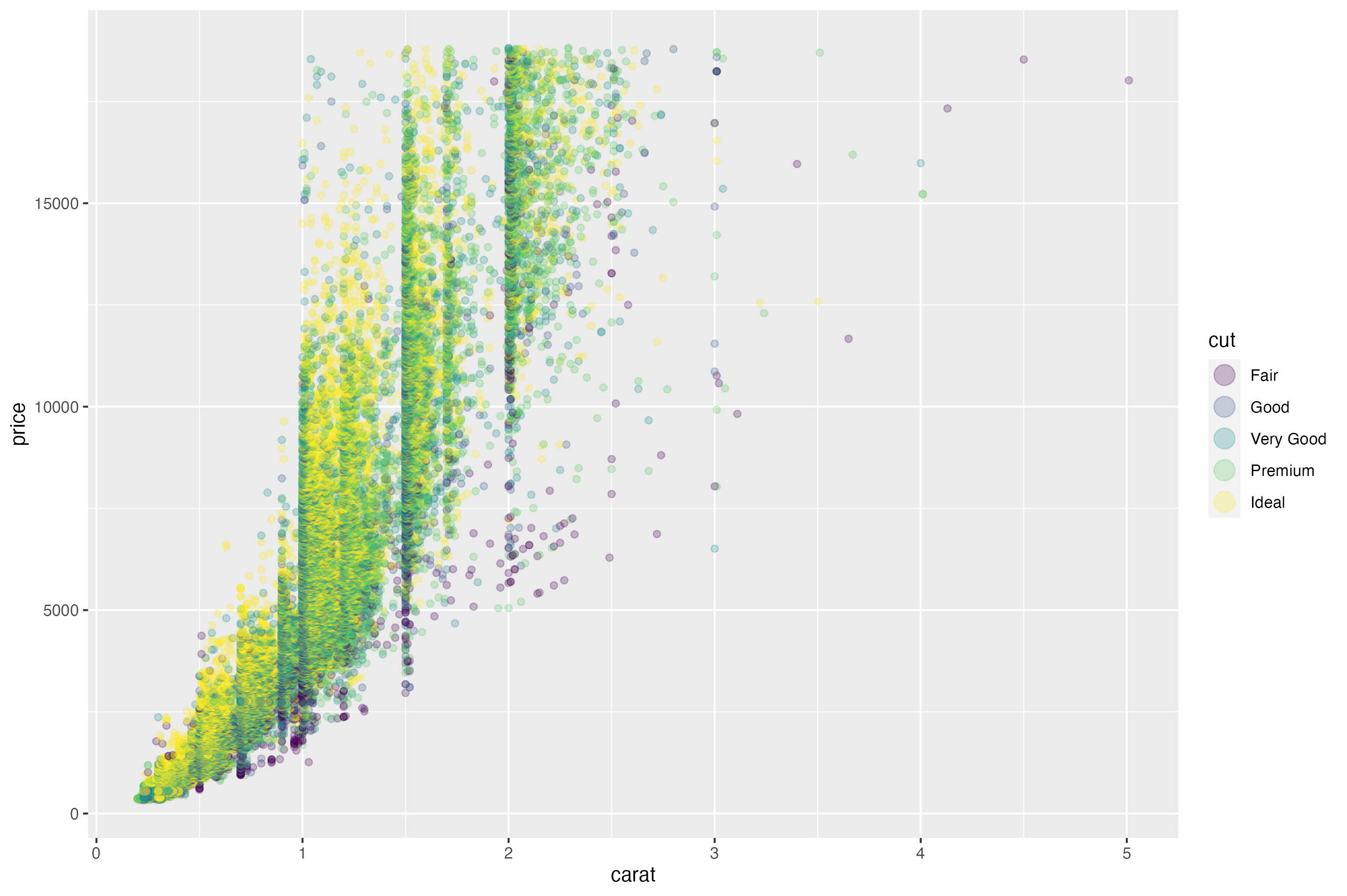
4-First, create the following plot. Then, modify the code using override.aes to make the legend easier to see.
ggplot(diamonds, aes(x = carat, y = price)) +
  geom_point(aes(color = cut), alpha = 1/4) +
  guides(color = guide_legend(override.aes = list(size = 5)))

ggsave("r-11-4-6-q4.png")